ALTR Design System and Rebrand
2021 - 2023
ALTR is the first no-code, cloud-native platform that simplifies control over users data. I was brought on board to implement the product lead growth model and better enable our users within the product. As ALTR’s Lead UX Designer, I instituted UX guidelines by developing a UX asset library and standards as well as designing and launching new features.

Original ALTR brand overview
The original brand was a bit disjointed and user hostile. Color choices were not accessible, Fonts were not used consistently, and components were a range of Material UI defaults and hard coded portions. The layout and components of the product were not built with a consistent design system in place and it showed.
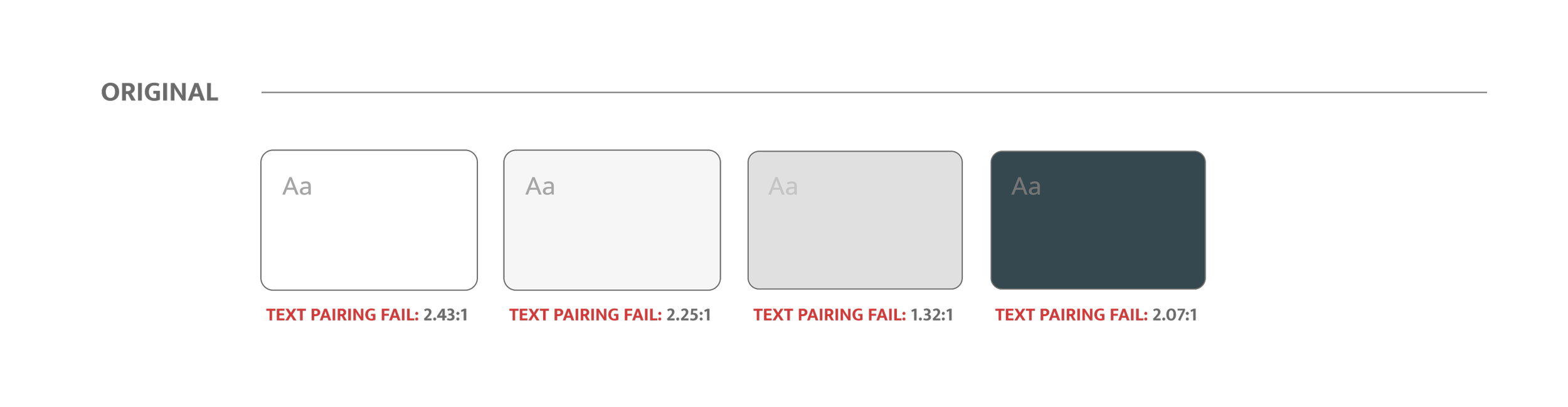
The original color system was not accessible and the brand also had a major communication issues overall. The brand green was used in instances to confirm that an action was successful, but also for standard messages which could be a related to the user needing to take action.
Fresh color system
The new color system passes WCAG standards with a AA to AAA rating.
The brand color is able to communicate to the user that the highlighted item is a main touch point. The success, error, or alert indicator was separated by both color and secondary information like text and icons.
Clean font family
The secondary issue found in the product audit was the mismatching fonts. I found three fonts in use in the product plus an extra completely unrelated font in use on the website.
In order to standardize our system and bring consistency across both product and marketing I implemented the use of the Mukta font family in the product. I also recommended the update of the marketing website and materials also use the same font and color base this helped our brand feel consistent and reliable.
The original fonts were used haphazardly throughout the product. By consolidating the fonts used the product immediately gained a level of consistency.
Atomic Design
With the fonts and colors updated I moved onto tackling the last piece of the puzzle before I could jump into the atomic design process.
I chose an icon system that had variety in fill and outline. This way we would be able to use them at both large and small scale within the product. This would leave the icons open for use on everything from the navigation and CTAs to large callouts that mimic marketing use cases.
Navigation Updates
One of the consistent complaints about the original ALTR navigation was that it was so confusing to find where you wanted to go.
When we ran a few user studies we found that users were having an easier time remembering where to go in the product for which page when we update the nav to have icons associated with each section of the product.
I updated the navigation slightly to enhance the usability of the product while keeping the overall structure the same.
Drawer updates
Our previous product design contained modules where the width of the drawer didn’t offer enough space for the amount of content they contained. This led to crowded form fields and confusion from users. The redesign of the drawers allows for more usable space as well as the ability to improve our input field components.
New wider ‘Drawer’ system allows for more breathing room within the form fields. This update allowed the team to be able to explore additional form field types expanding the usability of the drawer system.
Ready to see more?
Check out some other projects or send me a message on LinkedIn, if you want to chat.

Pingdom: Pricing System

SolarWinds: Design System & Rebrand